UBER RATINGs Redesigned
THE BRIEF
We were tasked to overhaul Uber's mobile app. The caveat was to restrict ourselves to their ratings system. In this assignment we were encouraged to "embrace our constraints".
There were 2 weeks to prepare for a class presentation; another week to iterate and construct a final wireframe).
The Team
KARIMA YULIA
NAVA TUMMALAPALLI
RUBY HONG
ANDREW TATGE
Ruby and Karima split duties making the art assets used for testing and deliverables. Nava made the powerpoint slide deck. Karima laid out the documentation with InDesign and I wrote the design rationale and qualitative questions for user interviews. We all participated ideating and sketching. Tests were carried out by my teammates using Envision. Each teammate made their own final mockups (mine is to the right).
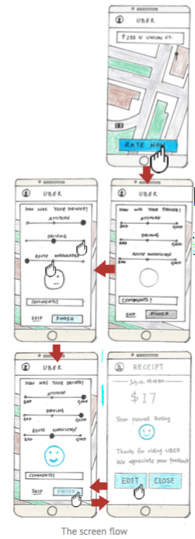
Final Wireframes of an Uber rating system redesign
OUR PROCESS
EVALUATING UBER'S 5 STAR RATING SYSTEM
We started by brainstorming the relationship between Uber drivers and customers, and what their attitudes and issues with rating systems were. We used sticky notes to affinity map driver and rider issues. We then responded to, and elaborated on the themes with markers.
SECONDARY RESEARCH
News stories reinforced a recurring theme from affinity mapping: there was mismatch between what customers and drivers considered an acceptable rating. Drivers, more than passengers, felt the system could be arbitrary and overtly strict. Furthermore, drivers didn't get information to help them improve their performance. A few research papers I found studied the distribution of scores in five–star rating systems. Moderate reviews were atypical and underutilized, and depending on the context (Amazon.com, Uber, film reviews) a rating could mean different things.
SKETCHING ALTERNATIVES
INITIAL APPROACh
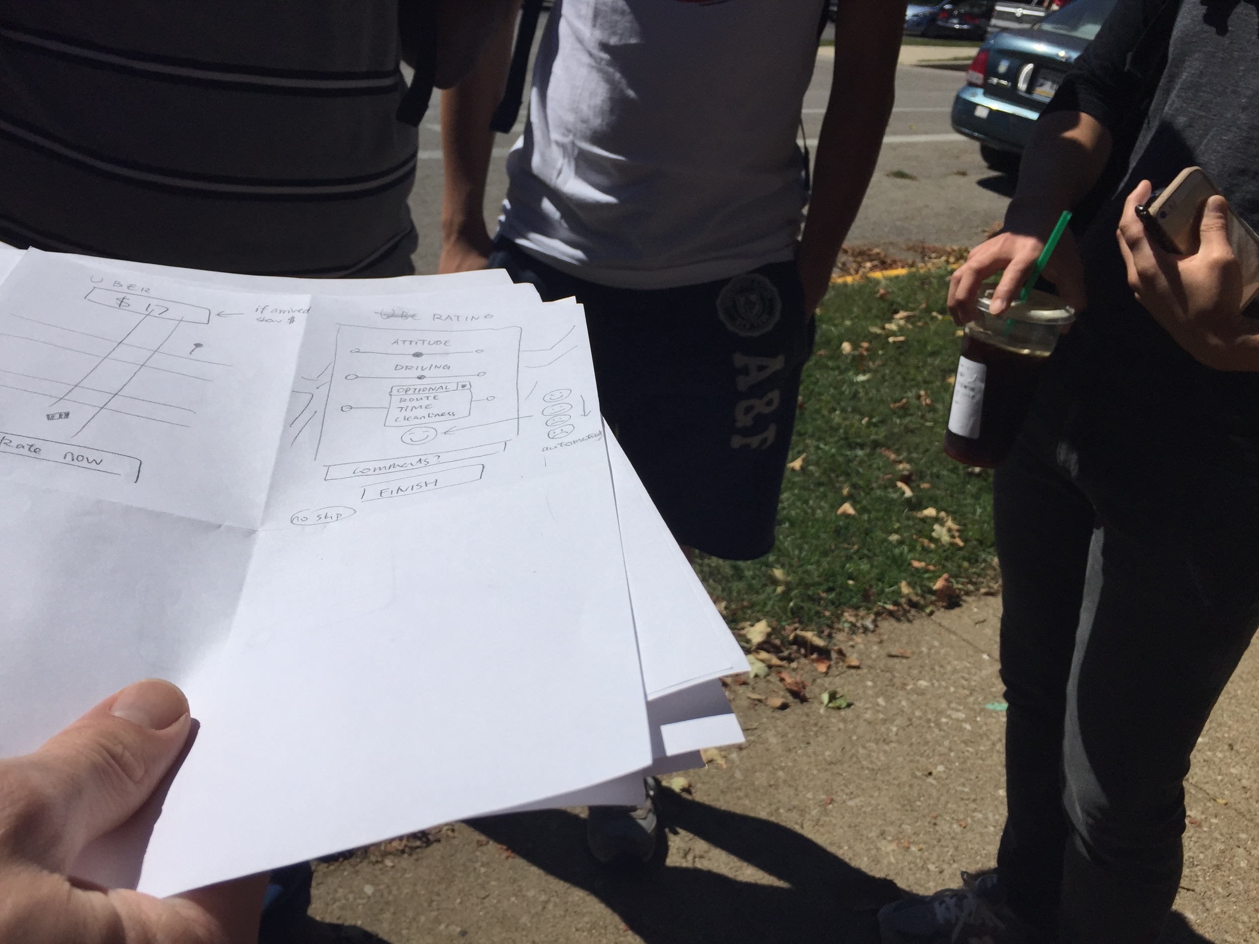
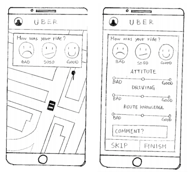
The first design we developed was a combination of a three–face rating system for the whole ride followed by a more descriptive word bank. Users would be shown a different word bank depending on their overall rating, and could attribute different adjectives to the car or driver. We thought this approach would give drivers more meaningful information about what could be improved (rather than a number).
USABILITY TEST NO.1
The first design we developed was a combination of a three–face rating system for the whole ride followed by a more descriptive word bank. Users would be shown a different word bank depending on their overall rating, and could attribute different adjectives to the car or driver. We thought this approach would give drivers actionable information about what could be improved.
REVISING THE DESIGN FOR SUBMISSION
Earlier in the term we read Card, Moran and Powell's GOMS paper, which may have influence our trying to cut everything down to one screen and condense. We continued sketching. We replaced the word bank with a trio of sliders that could provide drivers with more specific information. Ruby was able to run the design by one subject from the first usability test subject before a final iteration and preparing our documentation for submission. Between our last test and presentation to the class we changed the smiley from being an overall score chosen by the rider (as seen in the middle picture below), to a reactive indicator of the driver's slider scores (below right).


CLASS PRESENTATION
Critique focused on whether three sliders were any less ambiguous or prone to mis–matched expectations than a 5-star scale. Another criticism was the ambiguous relationship between the sliders and smiley. People didn't seem to mind our backend concept: that the 3 categories riders were asked to rate, and their quantitative impact, could be adjusted over time in response to different markets, drivers, or market research/frequently seen issues in rider's additional comments.
Iterations
For this project we had to pick a detail to do 12 iterations on. We decided to iterate how, or if, the face should be included with the three sliders. Each member of the group came up with a few variations which we shared with each other and combined into twelve different versions.
Feedback from peers was fairly consistent that language specific to a category was better than "good" and "bad." Color coding, especially yellow for the neutral rating, and symbols were more confusing than different smileys, which were received better than plain dots.
FINAL DESIGN AND WIREFRAMES
With the feedback we received from peers we agreed on a final design and individually produced wireframes. The one I created below was made using sketch with free templates and icon sets downloaded from http://www.sketchappsources.com/.
TAKEAWAYS
- In primary research, scenarios given to test subjects should not be too numerous or too complicated…I went a little overboard with the scripts.
- Testing early and often can move the team along faster than debate and discussion. Testing the word bank idea instead of getting further into it saved a lot of time.
- Rationale for decisions should be sprinkled throughout the design's documentation, not isolated into its own section.
- Some screwier iterations got the response we expected: they were a too weird or different from our core concept. This might indicate we should have been choosier with our iterations in the first place.
- I used Sketch for the first time to build the wireframes. Since then I've tended to use Sketch for quick items or annotation, but still use Illustrator for anything more complicated.


