Here are some things I did during my senior year of college and prior to starting my MS in HCI/D.
I don't consider myself a professional graphic designer, but I do think I have visual literacy and competency with the Adobe Creative Suite
Year
2012
Software
Illustrator
Context
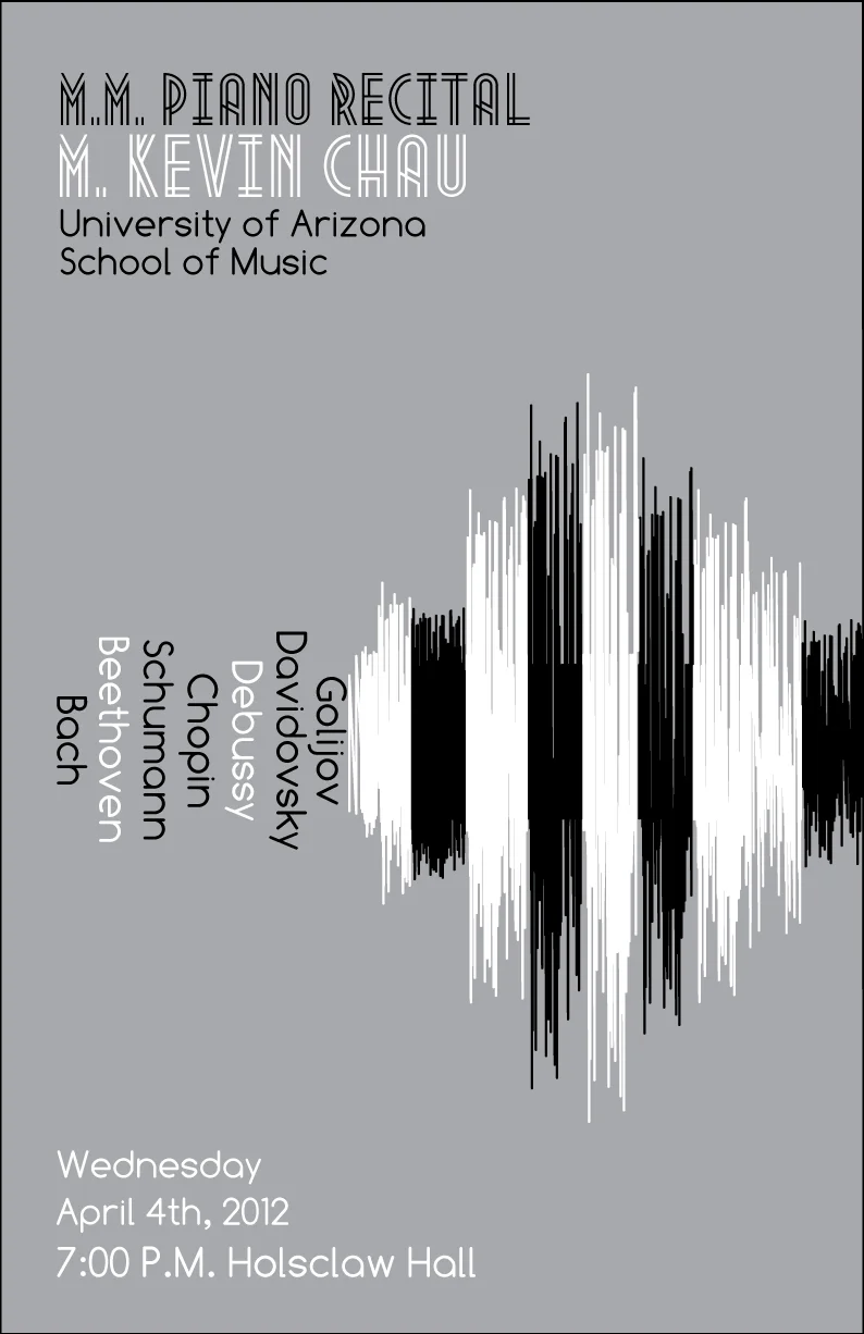
An old roommate, Kevin Chau, told me he wanted something minimalist with electronic overtones to promote his Master’s Piano recital. He suggested sound waves as a motif, which helped immeasurably. This allowed me to chronologically list the composers, imply piano keys, and incorporate the electronic motif in a succinct way without resorting to cliché piano imagery. The end product was simple, but layered with meaning about the past and future of music. The spare design also let me showcase a flashy typeface: “Metropolis 1920” by Josep Kelava.
Year
2013
Software
Illustrator
Context
Kevin Chau asked if I'd do another poster that was clean and modernist like the "sound–wave" one had been. I created a display typeface of letters made from piano key in Illustrator, but readability was an issue. I tried abstracting the piano shape and came out with something inspired by Saul Bass. Wanting to give create some depth and complexity, I outlined the rigid framework with varying, inky flourishes.
In hindsight, I like how the central image is framed, but I'm a little uneasy about how some of the other information floats. Also, the body type's color coding of composer, song, etc. suffers from readability issues.
Year
2008
Software
Photoshop
Context
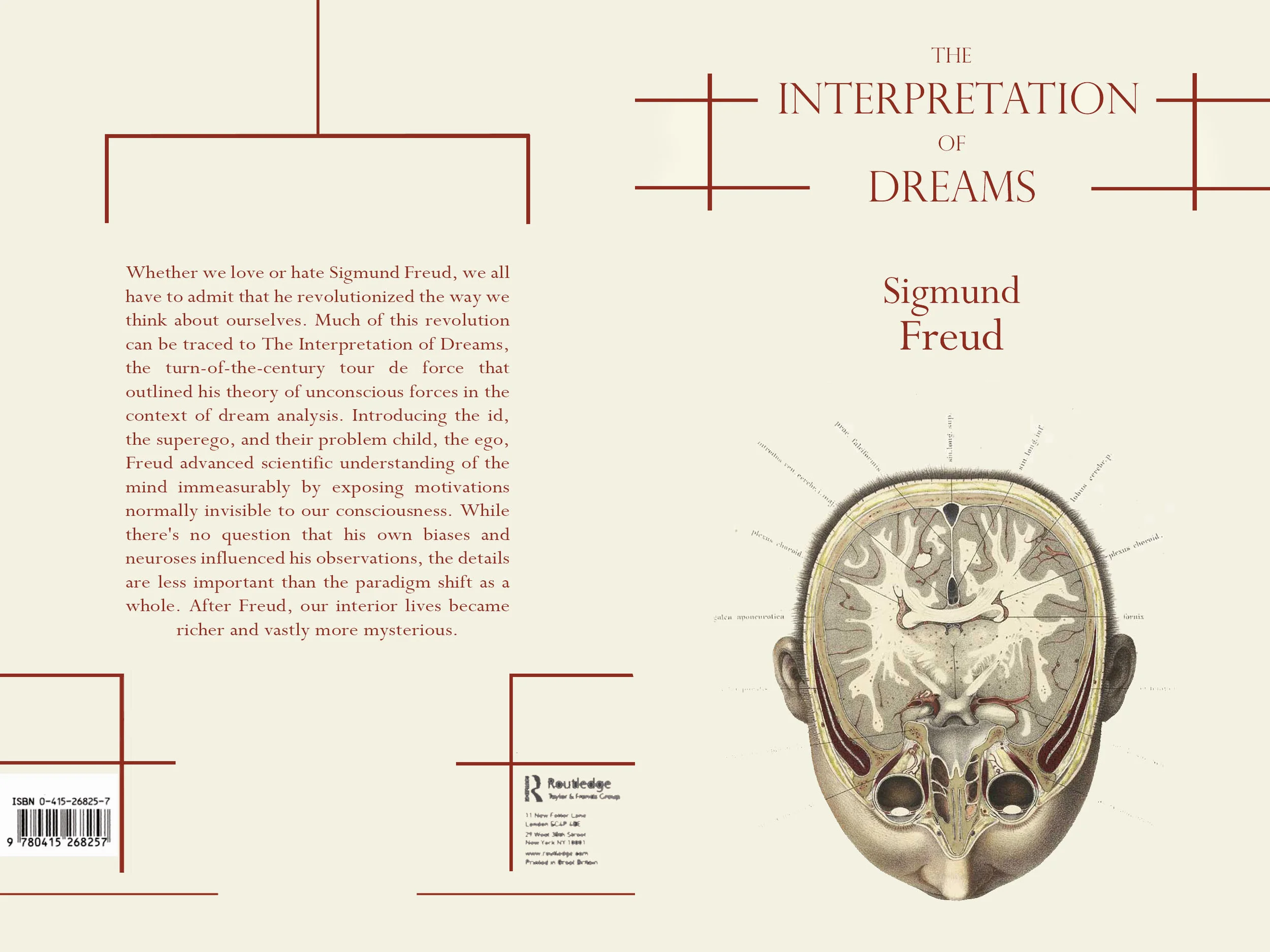
I was creating a book cover for my graphic design class. I had read The Interpretation of Dreams for an Introduction to Religion course and was intrigued by the idea of doing something related to dreaming. Rather than go with phantasmagoric imagery—more appropriate for Jung maybe—I wanted to find something that bridged the mind to something more clinical. I searched for antique skull diagrams on Google; the challenge was finding an image that did not overemphasize death or the mechanical aspect of skeletons.
I did not create the illustration or the copy. The graphic is taken from an illustration by Christian Wilhelm Braune and reprinted by the U.S. Government and is part of the public domain.
I did choose image, the typesetting, color scheme, and create the layout.
Software
Photoshop
Year
2008
Context:
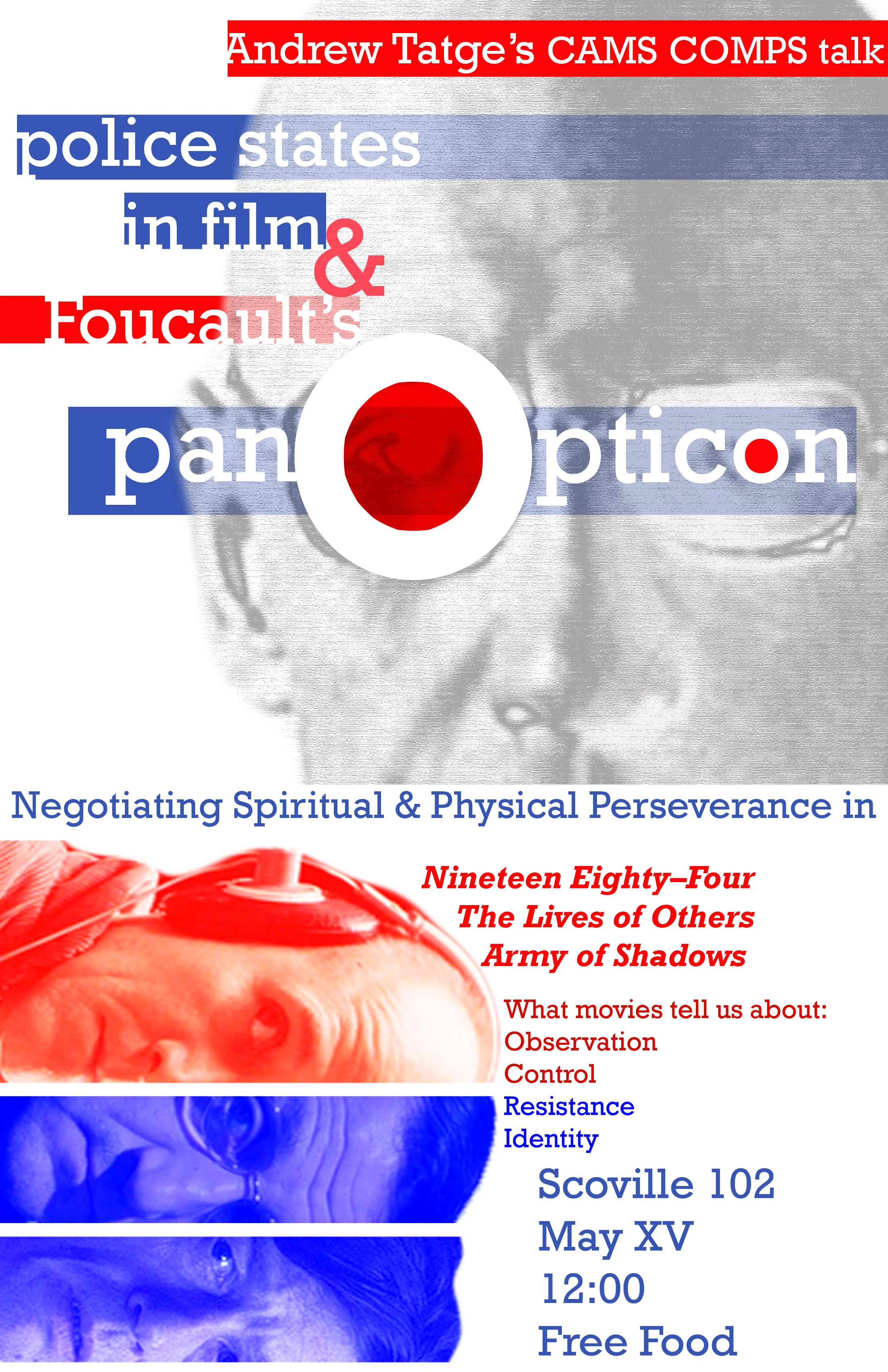
This was the poster I designed to promote the presentation of my Cinema and Media Studies comprehensive exercise, or COMPS. The lower half associates blue with the resistance movements in these films, and red with the disciplining faction. At the time I felt clever using Michel’s Foucault’s eyes and lenses for the “o”s in “panopticon,” but in retrospect I could have integrated top, bottom and text in more cohesive manner.
Year
2013
Software
Illustrator and Photoshop
Context
Before leaving Proof Restaurant to work at The Cheese Shop of Des Moines, I was asked by my manager if I would create a design to promote a multi–business showcase at the restaurant. I wanted to get practice using photographs and color gradients after doing so many "flat" images. I took a photograph before service one night of a champagne flute to hint at the theme while creating depth and contrast with the restaurant space that would host the event. The display font "Fancy Me" was designed by Marie Michelle Dupuis for use without restriction. Logos were provided by their respective companies.
Year
2013
Software
Illustrator and Photoshop
Context
While working at Proof Restaurant, I took advantage of the restaurant's monthly dinner theme to practice graphic design. I started with a big, imposing serif font to use as a mask over a map background to reinforce the theme. To get a high quality map I used the USGS National Map service to look up different maps of San Francisco—one of the cities used in the dinner. I settled on a section that had thick red highway lines that added variety, flow and invited closer inspection.
I wanted to make the big down arrow a more obvious southern tip of a map compass, but toying with the arrow width and adding the other three cardinal directions, diminished the overall impact and readability.


